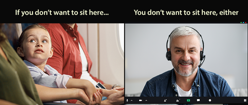

Whether you’re taking a selfie, sitting on a video conference call, or filming someone else, it is instinctive to want to be in the middle of the frame. That’s where attention is focused, right? It’s called the “hero shot” for a reason, right?
In truth, you’re much better off if you do something counterintuitive, and sit (or have your subject sit) just to the left of center. You look much more dynamic, energetic, and interesting than if you’re smack in the middle.
Take a look at this photo. The meditating man is sitting perfectly in the center of the frame. He looks calm and still, as he should. Like you couldn’t move him with a crane. It’s exactly the effect you want for this kind of image. 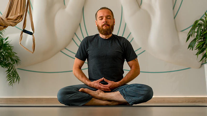
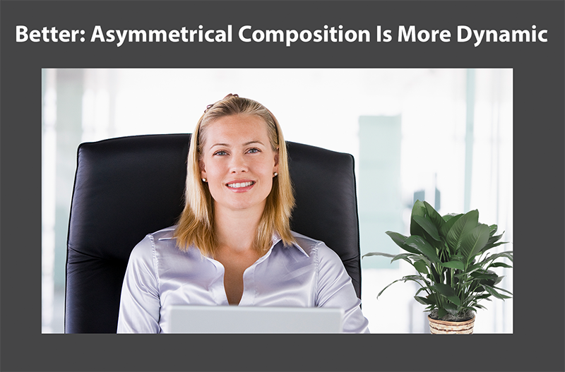
Now look at this image. The woman is still the focus of attention. She’s also sitting perfectly still. But she looks much more energetic and interesting.
The reason is that the composition of the meditating man image is an equilateral triangle, perfectly centered in the middle of the frame. Except for minor details in the background, it’s symmetrical and appears solid and immoveable.
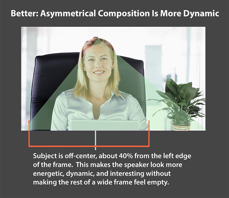
On the other hand, the composition of the image of the woman is a scalene triangle, with sides of different lengths and a focal point that’s a bit off-center. There’s more movement and energy to the composition, yet because she’s not on the far left of the frame, the right side does not feel empty.
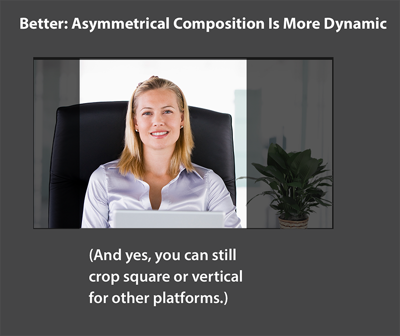
One of the reasons often given for framing for the dead-center is that later you might want to crop the video so that it’s square or vertical, for Instagram, TikTok, or other platforms. There’s usually so little room in those frames that you do want your subject in the very center, as large as possible. That’s perfectly fine, and you should do that. But you can get the crop you want out of a video with an asymmetrical composition, as in this example. Any editing application, even one on your phone, will allow you to crop a centered, square or narrow frame from an asymmetrical video.
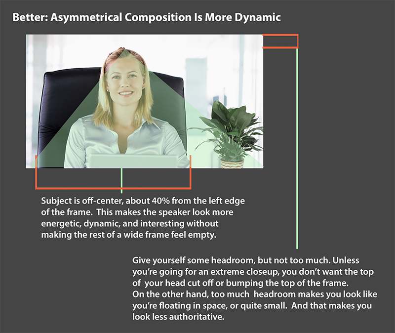
Here’s one more tip: give yourself some headroom. Do you notice that her head is not bumping up against the top of the frame? Neither is there so much room that she looks lost in her environment. There may be times, of course, when you want to “punch in” and use a camera distance that’s very close up. But for most uses in business, especially for casual, conversational-style videos, you probably want a comfortable distance that’s somewhere in the middle.
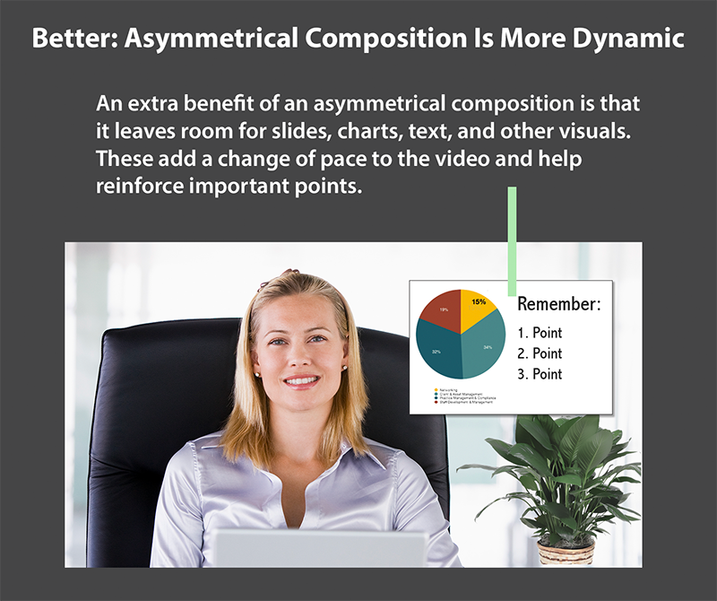
Another advantage to sitting slightly off-center is that it gives you room for graphics, including slides, charts, and text that can add visual interest and help you drive home your point.
And now for the pushback
For some reason, a lot of people don’t like this advice. I’m not sure why; it’s not exactly a high risk to try it. The argument we usually get back is something like, “Newscasters are always in the middle.”
Actually, they’re usually not. They’re sometimes close to the center, but not quite in the middle. On the rare instances when they are exactly in the middle, it’s almost never for more than a few seconds at a time. Often, the main anchor is the one close to the middle, but when they cut to shots of field reporters or other contributors, the second person is very much framed to the left or right of center.
A television professional I know–someone who has worked on more than a dozen shows, in roles ranging from post-production supervisor to producer–confirmed that editors avoid the dreaded dead-center shot, for all the reasons I described above. It’s too static, too boring, and doesn’t hint at the momentum that will carry viewers from one scene or idea to another.
Here’s one final, and very powerful demonstration of the power of avoiding the middle. An online design publication called Creative Bloq published an article that includes seven great print ads from the 1950s. Guess how many of them have the hero product smack in the middle of the design?
That’s right. Not one.
Related posts & Content
How To Make A How-To Or Explainer Video (With downloadable tip sheet for quick reference)
Download PDF: Easy Video Tips for Lighting and Composition