
Or, Sometimes “Less Is More” Is Less Than Zero
In an meeting at an insurance company, a brand executive said this: “The email copy is too long.” Then he quoted Bauhaus School architect Mies van der Rohe: “Less is more.”
The email letter was a grand total of three sentences. No exaggeration – three sentences. (I was reminded of comedian David Steinberg, who was advised, early in his career, to shorten his name to something less Jewish. “Shorten it to what?” he asked. “St ?”)
The insurance company is in the process of converting their very large website into a format that supports this less-is-more philosophy. So anyone who responds to this three-sentence email will be taken to a homepage with a beautiful picture, a simple headline, and three very short bullet points.
If you’re interested in one of the products, you can click on a button to learn more. Which takes you to another page with another simple headline and three more very short bullet points. And another “Learn more” button, which takes you to..well, you get the idea.
The company is very excited about this new approach to their website, and early data seems to be bearing it out. Prospects click much more, and visit many more pages, than they did before. So, the new format is a success. Except…
Their conversions suck. People click through page upon page upon page, but then they go away. Some of the website pages are still in the old format. There’s too much copy, too much of it is jargon, and they could absolutely benefit from editing and organization. But I’d be willing to bet that those old pages, cluttered as they are with “facts” and “benefits”, have a higher conversion rate than the new “less is more” pages.
I’ll tell you why I think that: because on every single client website that we manage, pages that offer more information, cleanly presented, and structured exactly the way that a visitor needs the information, do better by every measure than pages that are merely billboards.
They have more repeat visitors. Visitors stay on those pages longer. When we offer a white paper, brochure, or other download, more people take advantage of the offer. Those pages get passed on to other decision-makers within an organization. They often become entry points for other pages in the site, via visitors’ bookmarks, shared links, or search results. When visitors take action and become leads they tend to be much more highly qualified and volunteer much more information than visitors of ordinary pages. Most important, they convert to customers at a dramatically higher rate than visitors overall.
This is true universally, whether the site is for a sales organization, a B2B, B2C, or a service. It’s true for manufacturers, real estate, healthcare, home improvement, and C3 Advertising.
Plus —and this is important —you need about 300 words per page for SEO.
And it’s not just websites. It’s been a guiding principle of good direct mail for decades. We’re seeing this principle played out over and over again in every media we test, from trade show booths to video. When we present
- the right information
- the right amount of information
- in the right way
- to the right people
- at the right time
we get much better results. As measured in REVENUE.
So why the disconnect? Well, for three reasons:
- “Less is more” is not a truism. It’s marketing folklore, repeated so often that people accept it as fact.
- Too many people stop tracking results at the point of entry. About a year ago I attended a panel discussion on mobile marketing. After the presentations, a woman in the audience asked a brave question: “We’re all very proud of our click-throughs,” she said. “But how many of us track the sales generated by our mobile ad campaigns?” I think three of us raised our hands, in an audience of about 75. “Well, then, the rest of us had better start,” she said. “Or in six months we’ll all look like fools.”As we all should know by now, click-throughs alone don’t matter. Neither do “likes,” or opens, or search-engine rankings. Revenue matters. And to get revenue you need to get people to take action.
- Mies van der Rohe did not mean what you think he means. It’s absolutely true that the great architect said “less is more.” Most people don’t realize he was talking about ornament, not function…and that there’s more to the quote.
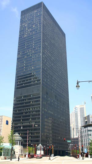
The beauty of a Mies van der Rohe building is not that it’s “less”, but that it gets out of your way. Take 330 North Wabash in Chicago, or as it used to be called, the IBM Building. You walk in and you know instinctively where you’ll find everything: escalator, elevator, information desk, offices, even the bathroom. You get the sense of grandeur, power, and brand of the owners, without a lot of visual distractions. From the minute you see it on the street to the minute you get to your meeting inside, you’re lead seamlessly, effortlessly, and intuitively into what’s important: the people who work there and the work that they do.
The goal of advertising is to lead a prospect seamlessly, easily, and happily through the argument you make for your product or service. The desired result is that someone accepts your call to action. If you did your job right, there’s revenue at the end of the rainbow. Would Mies have approved? You bet. Because he also said “God is in the details.”
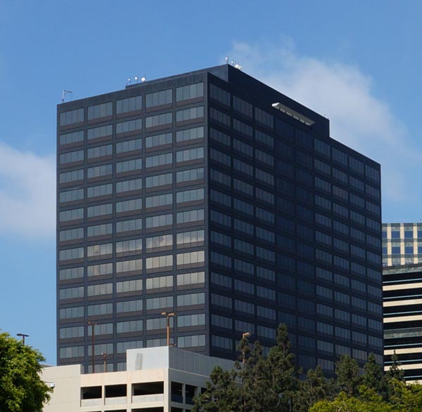
Top photo: Bauhaus-style building in Westwood, Los Angeles, California. Photo by the author.
Michelle –
Another great post!! I get so frustrated when people adopt some mantra – out of context, with little relevance and less insight – and throw it on the table as though it meant something without ever referring back to what we’re ultimately trying to accomplish. Remember in the early days of the web when everyone had those “flash pages” as the homepage of every website? What a waste of time and bandwidth!
One of my favorite things about your work is your relentless focus on results that matter, rather than on CTRs that might look good to the uninformed but don’t actually mean anything at all.
Keep the faith – and don’t let us forget it!
Thank you, Marti.
Re your comment: “throw it on the table as though it meant something” — you have nailed it!